Data visualization is an essential aspect of data analysis, providing a clear way to understand and interpret data. Python, with its rich libraries like matplotlib and seaborn, makes data visualization both accessible and versatile. This guide will demonstrate how to create a Python script to visualize data from a pandas DataFrame, employing these powerful libraries.
Pandas: A library for data manipulation and analysis, ideal for working with structured data.
Matplotlib: A plotting library for creating static, interactive, and animated visualizations in Python.
Seaborn: A statistical data visualization library based on matplotlib that provides a high-level interface for drawing attractive and informative statistical graphics.
Setting Up Your Environment
Ensure you have Python installed, along with pandas, matplotlib, and seaborn. If you haven’t installed these libraries yet, you can do so using pip:
pip install pandas matplotlib seaborn
Importing Libraries:
Begin by importing the necessary libraries:
import pandas as pd
import matplotlib.pyplot as plt
import seaborn as sns
Creating Test Data:
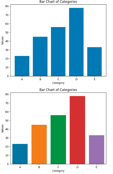
For demonstration, we’ll create a simple pandas DataFrame:
data = {
    'Category': ['A', 'B', 'C', 'D', 'E'],
    'Values': [23, 45, 56, 78, 33]
}
df = pd.DataFrame(data)
Visualizing Data with Matplotlib and Seaborn:
Use matplotlib or seaborn to create a bar chart:
# Using Matplotlib
plt.bar(df['Category'], df['Values'])
plt.xlabel('Category')
plt.ylabel('Values')
plt.title('Bar Chart of Categories')
plt.show()

# Using Seaborn
sns.barplot(x='Category', y='Values', data=df)
plt.title('Bar Chart of Categories')
plt.show()
Run the script to see the visualizations. The script should display two bar charts, one created with matplotlib and the other with seaborn, representing the ‘Values’ for each ‘Category’ in the DataFrame.

 Function")


")